
It’s not unusual for a major company to go out and rebrand their product. Some of it might just be a logo design or it could be how the product is packaged. For sports teams, it usually involves an overhaul of the team’s logo and mascot.
When it comes to baseball, it happens all the time. Teams get new look jerseys, new hats, and even new mascots. The Chicago Cubs added Clark the Cub in 2012 and went with the walking bear logo at some point in the early 2000s for their alternate jersey. We even saw the Tennessee Smokies dial up some new logos in the early 2010s as it solidified their relationship with the Chicago Cubs. South Bend did the same changing from the Silverhawks into the Cubs in 2015.
Most recently, we’ve seen the Copa de la Diversión initiative do a little re-branding for Iowa, South Bend, Myrtle Beach, and Eugene, when they were a Cub affiliate. In 2019, the Pelicans added a Saturday jersey called Palmetto State with the state tree of South Carolina and it included an awesome hat that had palm leaves attached to a baseball bat.
Over the past six months, we’ve seen Myrtle Beach’s pirate pelican go viral and I want to see a jersey that goes with it at some point this spring or summer.
Out of all the Cubs’ current affiliates, I would like to see the Iowa Cubs be the next team to go through a rebranding.
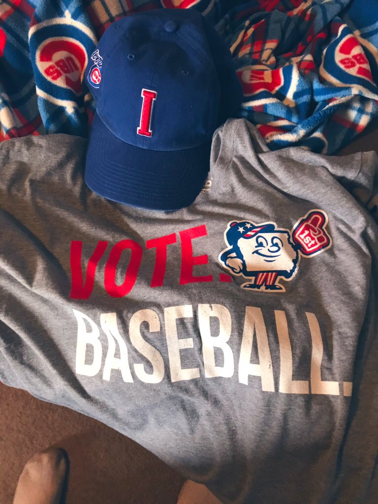
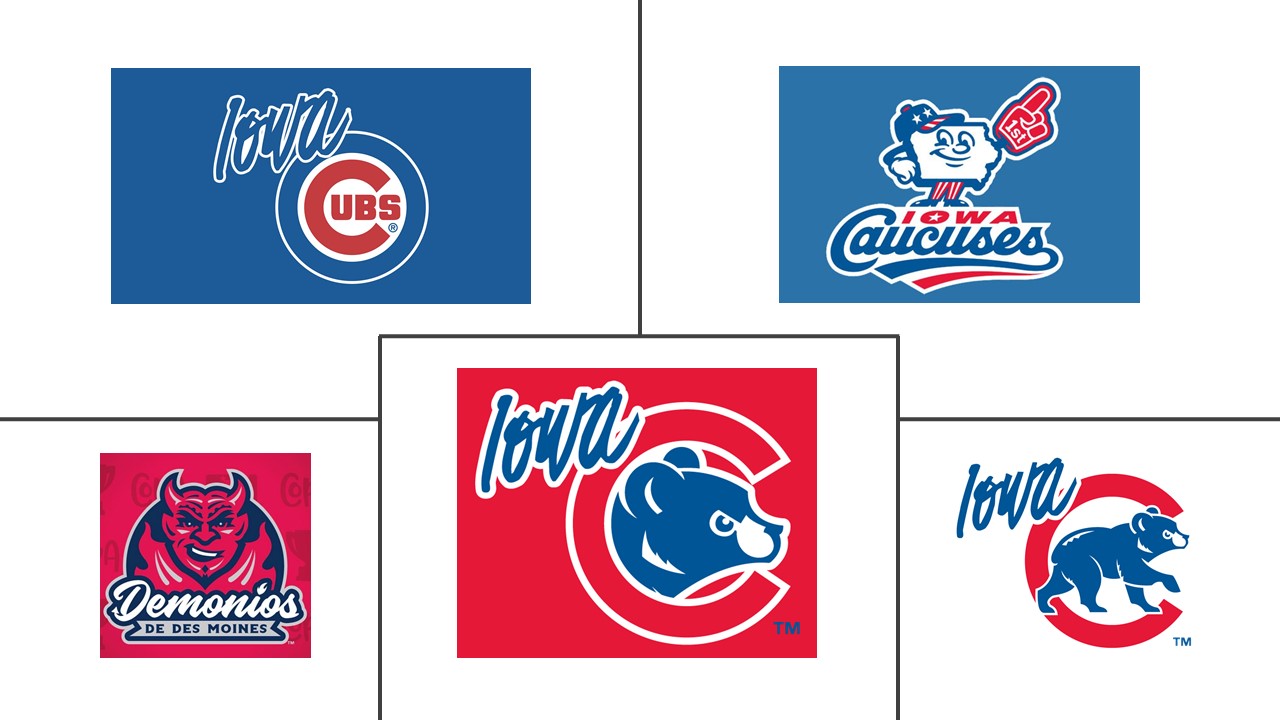
In some ways, Iowa has already done that for a little bit by joining the Copa de la Diversión with the Demonios. They also included the Iowa Caucuses, an alternate jersey for which I bought their awesome T-shirt that says “Vote Baseball.”
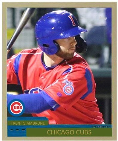
In 2019, Iowa unveiled an alternate red jersey which did not sit too well with many of my friends on Twitter. I kind of liked the jersey because it popped when I made baseball cards. It was something different than the normal pinstripes or walking bear blue jersey or road greys.
What Iowa would need is just pretty much a new logo that is modern and fits in with both the Cubs identity and also something from Iowa. Maybe it’s a bear coming out of a cornfield with a bat and a glove. But it’s got to be something other than an “I” or the word Iowa or even the walking bear.
Here’s why Iowa should take my advice and investigate redoing their affiliate logo.
1. Money
2. See number one.
 As a fan, I would find a new logo visually appealing. They’re not going to have to redo their jerseys a whole lot. The classic blue pinstripes are a winner. At most, Iowa should redo their hats. But what the rebranding will do is give them something to sell. It’s hard to get behind a blue hat with a red I. It really is. It’s a nice hat and it’s a clean design, but it’s not that modern.
A new logo design would sell a lot of hats and T-shirts and also push the Iowa Cubs into the 21st-century. We’ve seen it work well in Eugene, Myrtle Beach, South Bend and Tennessee. It can work for Iowa as long as they choose wisely.
What they can do to get started is to dial up Myrtle Beach, Tennessee, or South Bend, who have all done a rebranding. I don’t know about you, but I just want to see an actual bear/cub that is their own rather than the big league club’s.

[…] little over a year ago, I wrote that the Iowa Cubs should re-brand. It looks like they took my advice, finally! The new look could come as early as next […]
LikeLike
[…] in February, I wrote over at Cubs Central how and why the Iowa Cubs should rebrand their logo, hats, and uniforms. I sort of got my wish […]
LikeLike
[…] to-do list is already done. A year ago, I wanted them to rebrand a little bit and they knocked it out of the park last month with their new bear logo hats. I will […]
LikeLike